Did you know that over 300 million people worldwide experience some form of color vision deficiency or visual impairment? When building a website or designing an application, it is easy to pick colors that look beautiful to you. However, if there is not enough contrast between your text and background colors, a huge portion of your audience will not be able to read your content. This is where a color contrast checker becomes an essential part of your web design toolkit.
In this guide, we will dive into what color contrast is, why it is critical for accessibility and SEO, and how you can use the free contrast checker on 99toolkit to ensure your designs meet international standards.
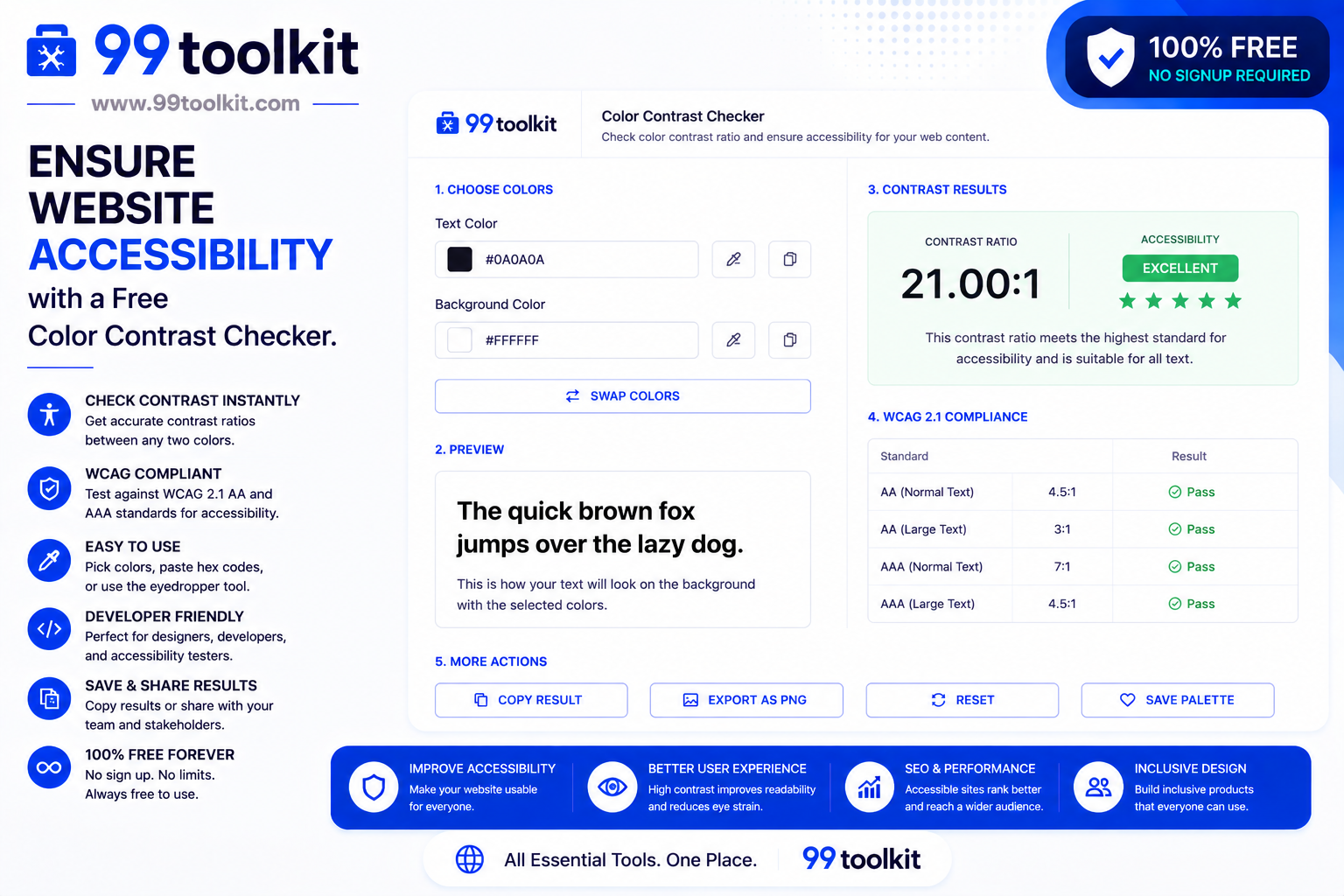
What is a Contrast Checker?
A contrast checker is a specialized design utility that calculates the visual difference (or contrast ratio) between two colors: typically a foreground text color and a background color. It evaluates these colors based on the Web Content Accessibility Guidelines (WCAG) established by the World Wide Web Consortium (W3C).
The tool outputs a numerical ratio (ranging from 1:1 for identical colors to 21:1 for black and white). Based on this ratio, the checker will tell you whether your color combination passes or fails the strict accessibility standards required for modern websites.
Key Features of the 99toolkit Contrast Checker
Our contrast checker is designed with both developers and designers in mind. Here is what makes it a must-use tool:
- Real-Time Calculation: See your contrast ratio update instantly as you tweak your hex codes.
- WCAG Compliance Scoring: Instantly know if your colors pass AA (minimum requirement) or AAA (enhanced requirement) standards for both normal and large text.
- Live Preview: See a visual representation of how your text will look on the chosen background before applying it to your CSS.
- Color Inversion: Quickly swap foreground and background colors to see if the inverse palette works better.
How to Use the Contrast Checker (Step-by-Step)
Using the tool is incredibly straightforward. Follow these steps to ensure your site is readable:
- Select Your Background Color: Enter the HEX, RGB, or HSL code for the background of your webpage. You can also use the built-in color picker.
- Select Your Text Color: Input the color code for your typography.
- Review the Ratio: The tool will instantly calculate the contrast ratio. Look for a ratio of at least 4.5:1 for normal text.
- Check the WCAG Results: The panel will display “Pass” or “Fail” for different text sizes (normal text vs. large headings).
- Adjust as Needed: If you fail, use the sliders to slightly darken your text or lighten your background until you hit a passing score.
Why Accessibility Matters (Benefits of Good Contrast)
Passing a contrast check is not just about following rules; it brings tangible benefits to your digital presence:
- Inclusivity: You ensure that elderly users, people with color blindness (Daltonism), and visually impaired users can comfortably consume your content.
- Better Mobile Experience: Users frequently read websites on their phones outside in bright sunlight. High contrast ensures readability in poor lighting conditions.
- SEO Advantages: Search engines like Google increasingly prioritize user experience (UX) and accessibility metrics. An accessible site is more likely to rank higher.
- Legal Compliance: Many countries now have strict laws (like the ADA in the US or the EAA in Europe) requiring digital accessibility. Using a checker helps protect you from potential lawsuits.
Real-Life Use Cases
Who relies on contrast checkers the most?
UI/UX Designers: Before a website layout is even coded, designers use contrast checkers in Figma or via web tools to ensure the brand color palette is actually viable for reading.
Frontend Developers: When translating a design into CSS, developers verify the hex codes to ensure compliance, especially for critical elements like “Submit” buttons or error messages.
Digital Marketers: When designing infographics, email newsletters, or social media graphics, marketers need their call-to-action (CTA) text to pop out effortlessly against the background.
Tips for Best Results
To maximize readability across your projects, keep these tips in mind:
- Aim for AAA: While AA (4.5:1) is the legal standard for most sites, aiming for AAA (7.1:1) provides the ultimate reading experience.
- Size Matters: Larger text (18pt or 14pt bold) requires a lower contrast ratio (3.0:1) to pass. If you love a low-contrast color scheme, restrict it to massive headline fonts.
- Don’t Rely on Color Alone: If you use color to convey information (like red for an error state), always include a secondary indicator, like an icon or an underline.
Common Mistakes to Avoid
Avoid these frequent accessibility blunders:
- Light Gray Text on White: It looks sleek and minimalist, but it is the number one cause of readability complaints. Always check your grays!
- Ignoring Button States: You might have checked your primary button color, but did you check the contrast of its ‘hover’ or ‘disabled’ states?
- Text Over Images: Placing text directly over a busy photograph often creates contrast issues. Always use a dark overlay or drop shadow behind the text.
Need to convert colors you found elsewhere? Use our RGB to HEX converter. Once your palette is accessible, you can organize it using our Color Palette Generator.
FAQs
1. What is a good contrast ratio?
According to WCAG 2.1 guidelines, a good contrast ratio for normal text is at least 4.5:1 (AA standard). For the best possible accessibility, aim for 7.1:1 (AAA standard).
2. Does contrast affect SEO?
Indirectly, yes. Poor contrast leads to a poor user experience, causing visitors to leave your site quickly (high bounce rate). Google notices this behavior and may lower your search rankings as a result.
3. How do I fix a failing contrast ratio?
The easiest way to fix a failing ratio is to keep the same base hue but adjust the lightness. Make dark colors slightly darker, and light colors slightly lighter until the tool indicates a “Pass.”
4. Are there exceptions to the contrast rules?
Yes. Logos, brand names, and purely decorative UI elements that carry no informational weight do not strictly have to meet contrast guidelines.
5. Is the 99toolkit contrast checker free?
Absolutely. You can use our color contrast checker as many times as you need, entirely for free, right in your browser.
Conclusion
Beautiful design should never come at the expense of usability. Ensuring your website has proper color contrast is one of the easiest, most impactful steps you can take toward making the web a more inclusive place.
Bookmark the free contrast checker on 99toolkit today. By integrating this quick check into your daily workflow, you will build better, more accessible, and more successful digital products for everyone.